A car that gets better and adds features over time
posted by Jeff | Friday, October 16, 2015, 8:07 PM | comments: 0One of the really crazy things about the Tesla Model S is that it's always improving. The company pushes software updates to the cars on a fairly regular basis. This week, they're pushing out the v7 software, which adds the "autopilot" features if you paid for those and have the hardware (it started shipping with cars late last year). I didn't spend the extra $2,500, and don't intend to do the $3,000 to buy it after the fact, but it includes auto steering, adaptive cruise control and parallel parking. Still, it has quite a few changes that do apply, and they're free. The biggest change is arguably the configuration of the dash, but I'll get to that. Here's what I'm into:
- Faster and more efficient climate control. Not sure how this is achieved, but living in Florida, I noticed it gets cool much faster.
- Brake hold. If you're stopped, press the brake a little harder and it will hold even if you pull your foot off. This is particularly useful when stopped at hills, so you don't roll back.
- Smoother acceleration and braking at low speeds. This one is super noticeable. It already felt very precise, but now even more so. That precision is unexpected for something that can launch you to 60 mph in a few seconds.
- Collision avoidance to cars in your blind spot. While graphically it shows them now on the dash, the car will actually steer you away from a car if you're changing lanes and there's a car there.
Keep in mind that while I didn't pay for autopilot, the hardware does a bunch of other stuff, too. The front radar will hit the brakes before you can to reduce the impact of a frontal collision. The proximity sensors around the car measure the distance to stuff, which is particularly useful when parking, and it shows the distance on the dash. A camera behind the windshield finds the lines on the roads, which is used in the lane departure warnings (and for autopilot). It also reads the speed limit signs and reminds you when you're speeding.
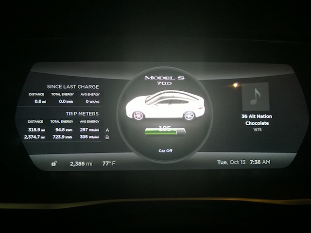
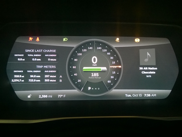
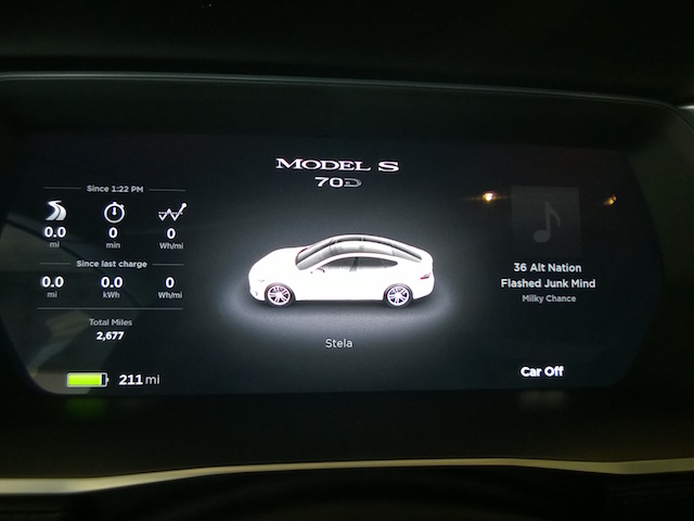
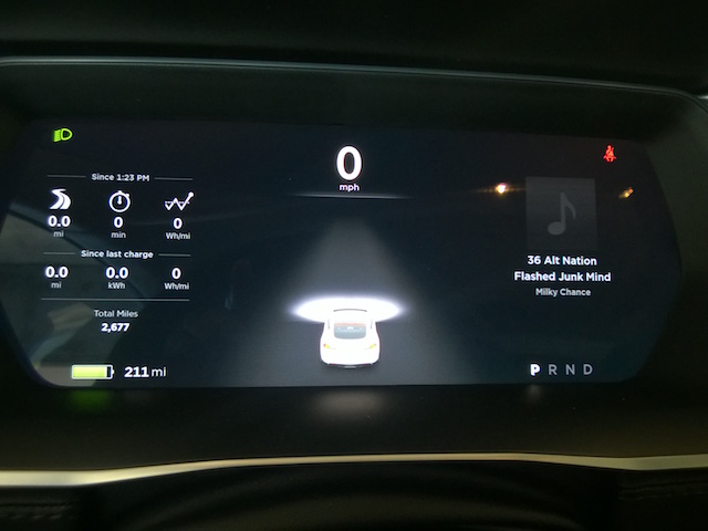
There is some amount of "controversy" among owners about the dash changes. Some people would have liked to have opted out of the changes. I admit, it's a pretty weird thing that they can just change the way it looks. I think it's more functional, but it's not as pretty. I liked the gradients. Still, what the new interface provides is a better way to see the blind spot warnings, as they used to just draw a quarter circle around the speed gauge that you couldn't see with your peripheral vision. Here are the before and after shots, including the parked and driving screens...
Before:
After:
Comments
No comments yet.


