Favorite things in Windows Phone 8.1
posted by Jeff | Saturday, May 17, 2014, 10:40 PM | comments: 0I've been a fan of Windows Phone from the start. I've tried to be an advocate of the platform, while being honest about its shortcomings. It has been good to me overall, though I have to admit I've never been an app person. Aside from a few games, I've just never been very interested in what most apps do (especially since their Web counterparts pretty much can do the same thing). I'm probably not typical in that sense.
With the wave of Nokia hardware that came out about a year and a half in, specifically the awesome Nokia models with the great cameras, and the update that Windows Phone 8 brought, I was definitely sold to stay on board. iOS started to feel old and dated to me. The contextual "journeys" always made sense, and live tiles are still great because you don't need to open stuff up.
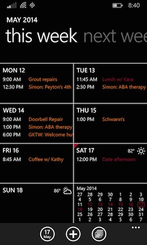
But there were little things that needed to get better. The calendar UI was awkward. Notifications across apps and core phone functions weren't unified. Every once in awhile you still had the rogue background thing that would zap your battery, and you wouldn't know why.
The new 8.1 updated addressed all of this, and I think the platform is more or less at app parity with the other platforms (my only complaint is the lack of an Amazon Cloud Player). Here are some screen shots of my favorite things.
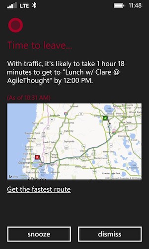
First there is Cortana. Named after the artificial intelligence construct in the Halo video games, she's your personal assistant, roughly analogous to Siri on iOS. You can tell her the usual stuff with your voice or typing, like "call Diana" or "find Indian restaurants," and she'll help you out. She's also pretty good at things like "remind me to call Diana at 4pm," and stuff like that. Where she really adds value is when you allow her to look at all of your stuff, like e-mail and your calendar, and she just takes it upon herself to do it. She'll get status updates on your flights found in e-mail, or if you have an address on an event, let you know when you need to get your ass in the car. That's seriously cool. She's still quirky at times, but usually gets things done. You can even teach her how to pronounce your name (so Kara could be properly addressed as "car-uh" if she wanted).
The new word shaping keyboard, or whatever they're calling it other than swipe keyboard, is completely awesome. I don't know how it does it, but you drag your finger around over letters and it figures out what you want to say. It's right most of the time. It took a little while to learn four letter words, but it's there now. It even suggests a little brown icon shaped like dog poo when I type "shit."
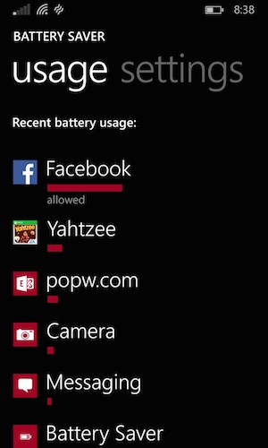
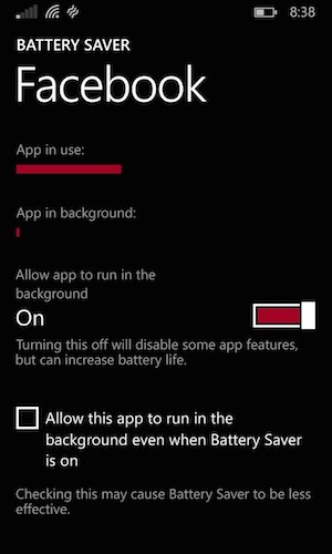
One of the more useful things is the new battery saver controls. They've always had a battery saver feature, which turned off background stuff when you reached 20%, but now they give you tons of control over everything, as well as data. You can opt out specific apps to the 20% rule (at your peril, of course), so they will run in the background no matter what. More importantly though, you can see how much juice any particular app is using, and then get a further breakdown to see if it's being an energy hog in the background, or just when you're using it. Windows Phone in the general sense is pretty good about this stuff, but in the event that something is going a little nuts, you can at least identify it. Just today, when I took the screenshot below, Facebook was misbehaving, and I could see right away what the problem was.

On a side note, we recently switched to AT&T's "mobile share" plan and added a friend to our account. Now we split the base $100 three ways and add $15 for each phone, and we save a ton (I still get the MSFT discount on the core $100 as well). The plan includes 10 gigs of data, and so far we haven't gone over 4 gigs total.
Also a win, since switching to this plan, I can use the wi-fi tethering. That means I can use my laptop or tablets pretty much anywhere, and I have a few times. Even with that, my share of the data usage has never gone over a gig or so. Again, I'm not really sure if that's typical or not.
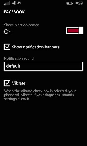
What I like is that now you can control, on an individual app basis, how each thing notifies you. You can choose whether or not to show it in the notification log, whether it should show the toasts, whether or not it should make a sound, and whether or not it should vibrate. So for example, I don't need to react to email when it arrives, but if I happen to have the phone in view, I don't mind if it pops up the toast on the screen. I don't need sound or vibration. Particularly since they've moved a lot of the social features out of the native operating system (more on that in a minute), this is a nice configuration option to have. It means that Facebook or WhatsApp messaging can work just like text messaging in terms of notification behavior.
There are a few things I'm not crazy about, but they're mostly "moved my cheese" moments. For example, the native Facebook stuff is largely gone. I can see why they did it, because the app is far easier to change, but it's not nearly as fast. On the plus side, because you can "deep link" to places inside of Windows Phone apps, it's still pretty seamless to get to a status update or photo upload. I just mourn the loss of speed. Facebook is also a little crashtastic on startup, where you might have to start it four times before it works. Presumably this is a temporary problem since it's not technically released yet.
Overall, I'm happy with the updates, and for now at least, the phone is more than just a utilitarian thing, and I'm enjoying using it. In fact, I feel like I'm rediscovering some of the nice things about the hardware, especially the amazing screen and camera. Now that Microsoft owns Nokia, I can't wait to see what happens.
Comments
No comments yet.