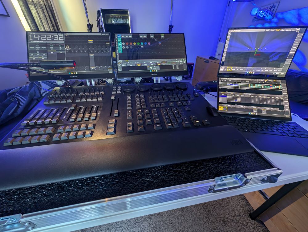
Review and setup guide: GrandMA3 onPC console with Asus laptop
posted by Jeff | Wednesday, September 11, 2024, 5:00 PM | comments: 0Before getting into it, let me set the context again for how the MA Lighting line of consoles works. The more hardware you buy, the more things that you can control. The software is always free, but you can't do a show without a piece of hardware. The "cheapest" complete system in one unit, screens and all, is the Compact model, and it costs $30k, controls about 8,192 parameters, and can control more with networked processing units. If you're curious, the Full-Size model costs $80,000 and 20,480 parameters out of the box. (Parameters are single functions of a lighting instrument, like pan, tilt, dimmer, color, etc.)
So if you're an enthusiast, want to learn and are just starting out, you can do everything in the software on a virtual rig for free, but you can't control any real light fixtures. Without the control surface, you're also having to use virtual keys or shortcuts to program, and virtual faders to run the show, which isn't really how real-life would work. What you can do is buy the onPC Command Wing console for about $7k, which controls 4,096 parameters, but includes no screens and no computer inside, so it's bring-your-own-computer. (You could also buy an onPC Port Node for about $2k, but you're still stuck entirely using your touch screens or mouse and keyboard.) I'll add that the control surface of this is exactly the same as the one on the $30k Compact model, only without the light-up faders. I've settled on a decent setup for this, and because people ask, I thought I'd write down what I have, with links.
- GrandMA3 onPC Command Wing - around $7k depending on the dealer
- Asus Zenbook Duo 2024, Core Ultra 9 version - around $1,700 - Amazon
- 2x Viewsonic TD1655 15" portable touch screens - around $270 each - Amazon
- 2x portable stands (sold under a million brands, all made in the same factory in China, I'm sure) - $28 each - Amazon
- OWC 11-port Thunderbolt 4 dock - around $230 - Amazon
- LED XLR desk light - varies, mine was $74 - Amazon
- Custom flight case for console only - varies, mine was $690 from a local vendor
The point is that you can get "in" to MA for about $10k and have a functional, reasonably robust way to control small to medium sized rigs. I imagine that you could recover some of this cost using it for real gigs, but that's a topic for another day. The only real limitation to me is that using pixel fixtures will burn many parameters. There's a part of me that wonders if they'll up the parameter allowance in future versions to accommodate this, because they've already doubled the onPC versions to the current 4,096.
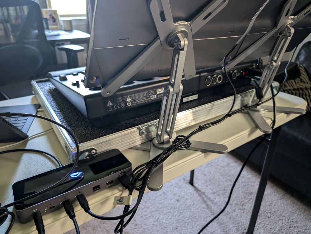
The disadvantage of using onPC is that you can't just crack open a case, plug in your network cable, and go nuts. However, the set up above comes together in a few minutes, and you'll have four screens available. What makes this manageable is the Thunderbolt dock, because it provides power to the portable monitors and the laptop itself, so you're not burdened by a bunch of power cables. You'll just have the dock and the console to plug in for power. The cables to the monitors carry the data and the power, making it all super convenient. If you manage them with a few zip ties, it's a fairly clean setup. The laptop, monitors, dock and cables easily fit into a laptop backpack. The dock also has ethernet, another thing that might otherwise require a dongle, though I'm using wifi at home (not recommended in real venues). I also have a cable to power the keyboard that pops off of the laptop, because its battery only lasts a few hours. My power strip happens to have USB power, so I just use that. That means the laptop has a single Thunderbolt cable connected to it.
Configuration once everything is connected for the most part just works. The software sees the console and outputs the 4,096 parameters over your chosen network protocols and the DMX XLR outputs. I'm outputting through sACN, and have a few different DMX boxes that hear it just fine without any extra configuration. The only glitch, and it only happens every third time, is that Windows gets confused about which screen you're touching, even though touch and video share the same cable. You have to dig into "tablet PC settings" and launch a process where you touch each screen then press enter. The easy way to check up front if it's right is to drag your finger across each screen, and see it draw a selection box. If it appears on the wrong screen, run the settings.
I've set up my basic show file to put the contextual on-screen encoders above the actual encoders on the console, which vaguely emulates the big consoles. I position the other one over the faders, lining up a playbacks window right in line. I put the masters and such to the left of that. The 15" screens might actually be a little big for this application, but scaling the UI and matching it to the laptop screens makes for nice large targets. So far I've never fat-fingered the wrong button on a screen. It feels like the laptop screens are best used for sequences, layouts and selection grids, though preferably on the lower screen. The top one is better for 3D or things that you monitor but don't touch often, because that screen isn't as stable as the others. The Asus has a solid hinge, but it still has some give.
I'm sure most people start their MA journey on a computer, but it is like a different world when you have the Command Wing in front of you, especially with the screens above it. Coming from a previous career in broadcast, I appreciate well made, durable, heavy gear. This thing is heavy and solid. The buttons are not clicky like a keyboard, and remind me a little of certain on-air broadcast radio consoles. There's one 4-pin XLR on the back for a light, and mine is not official MA. The AC plug is locking. I've tried the DMX outputs, but generally assume I'll be using networking. The faders are motorized, but not backlit with color LED's like the Compact and up. It's probably not a huge deal, but the colors would be good visual cues to know which executor page you're on without looking up at the screen.
When it comes to the software itself, I don't have a ton to compare to. I've written some stuff experimentally, I've played with ETC EOS a bit, and I've seen a ton of electronic but manual boards that, at best, store cues. Conceptually I understand what it should do because I'm a nerd and I go to a lot of shows, concerts and theatrical bits. As a developer, I find that the conventions are very much like object-oriented programming, almost to a fault. That works to an extent, but I find it clumsy to "debug" when you aren't getting the output that you want. In software, you have what's called a stack trace, that allows you to walk through the code at every step. In MA3, you have a bunch of tiny icons on different tiles on various screens. Even if you can remember what they all mean, it's not always easy to see how things are related. There has to be a better way.
Still, the more I work with it, the more I can translate something in my head into actual output. I'm attempting simple things with the six Chauvet Intimidator 260X's I have, and recipes are extremely powerful to create looks quickly, and reuse different components. I need to design (or download) a bigger rig to try more interesting things, but I don't think that I'm there yet. Admittedly, I'm not spending as much time on it as I'd like.
One thing to note is that MA3 appears to draw each window as an OpenGL 3D surface. Every window, that is, "screen" in the software, increases the use of the computer's GPU. For mine, it's roughly 20% GPU for each screen, so with four open, it's at a constant 80%. That's not even with the 3D visualizer open, which adds even more load. This is enormously inefficient, and disappointing that it's a thing. I realize the software is optimized for plugged-in consoles, but in this state you can't really use it on a laptop for long periods solely on battery. It's a huge power hog.
Outside of the hardware and software itself, there is a robust community out there willing to help and answer questions, which is fantastic. I'm surprised at the number of people who have plenty of hours behind the $80k machines. Then again, once you know what you're looking for, these things are everywhere. And if it's not an MA console, it's probably ETC. I see both in the theme parks all of the time.
Overall, it has been a good experience so far, even with the "cheap" version of the hardware. I still hope that they change their licensing model to include more parameters (something that the Capture design software should also do), because of the higher requirements of compound fixtures and pixel bars and such.
Comments
No comments yet.

