Review: Microsoft Surface RT
posted by Jeff | Monday, October 29, 2012, 10:49 AM | comments: 1I was pretty excited when Microsoft announced its new Surface tablet, if you don't count the fact that they did so without any indication of price or availability. "Here's something exciting, but we're not gonna tell you when you can have it or how much it will cost!" As I've said before, the tablet is a weird thing that I've always felt was a consumption device that I might not have a lot of use for, and yet I still have an iPad. In fact, the comparisons are impossible not to make.
So why buy? First, the "Metro" interface in Windows Phone showed a better way for mobile computing. Since so much of it is social in nature, why not bake things like Facebook right into it? You put in your various online accounts, and it lights up with stuff. My wife is one "object" on the phone, across Facebook, e-mail, text messages, etc. She gets her own live tile. Windows 8 expands on this, and since it has been available to the curious (and MSDN subscribers) for many months, I knew it could deliver that experience on a tablet or desktop computer.
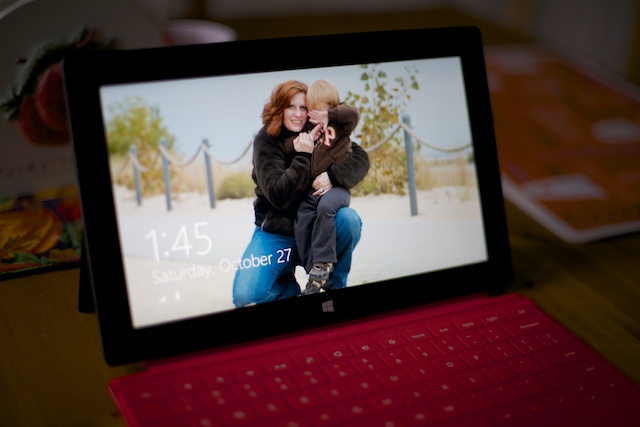
Before I get to the software, and that Windows 8 detail is important, let me talk about the hardware. Microsoft has been surprisingly open about the design process and work that it took to design this thing, and it's clear from the finished product that the time was well spent. Made of that goofy magnesium alloy ("VaporMg"), it has a nice metallic feel to it, without being slippery. It also looks like a continuously fingerprinted mess unless you wipe it down a bit. They made a big deal about the edges being tapered to 22 degrees, and I don't know if that really matters, but it's fairly comfortable to hold horizontally. It's a little tall to hold vertically, but just as our eyes are horizontal, so goes viewing this thing. In fact, the 16:9 aspect ratio really seems to fill your vision better than the 4:3 of something like the iPad (or any older computer, for that matter).
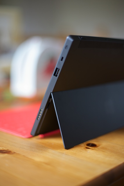
The hinge for the kickstand seems like it would be something weak and stupid, but it's far from that. The click it makes when you open and close it is satisfying like that of a new luxury car. It seems like something stupid for the designers to have spent time on, but it feels nice.
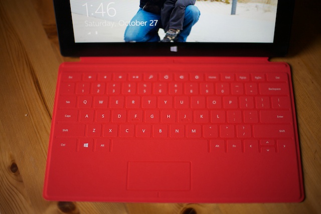
I opted for the touch cover keyboard, which is just slightly thicker than the iPad smart cover. Its connection to the tablet is the most solid magnetic thing I've ever seen. It will support the weight of the tablet. It only kind of works in your lap, but on a table it's remarkably not terrible to use. I was missing the space bar a bit at first, but after pecking out a few forum posts, I actually adjusted pretty quickly. If you flip it back behind the unit, it doesn't interfere with holding it. It also doesn't flop around like the iPad smart cover, since it has no folds. The mouse surface is a little small, but since the screen is touch, I find it generally unnecessary. You could use a Bluetooth mouse, if you wanted. Is it worth the extra hundred bucks? I think so, because clearly it's one of the differentiators that makes this feel more like a laptop when you want it to be.
Much has been made about the screen resolution, which is low compared to the Retina iPad. There's no question that text on the iPad is something of a miracle, whether it's in a Web browser or the Kindle app. That said, it's not as much of a step back on the Surface as I expected. Video looks great, which isn't surprising given the size of the screen and compression of Web-based video. The Metro user interface looks great, too, even with text or image heavy live tiles. I did end up increasing the zoom in Internet Explorer to 125%, partly because it makes the text more readable, but also because it just seems to fit the screen better. At 100%, most Web sites with fixed widths don't fill the screen very well. The screen is bright and contrasty overall (brightest and highest contrast of any tablet, according to one of the reviews I saw), and the fear of a lower resolution seems largely unfounded.
So about the software... this thing runs Windows RT, the build of Windows 8 intended for ARM-based devices (which run most tablets and phones). What this means is that it is pretty much Windows, but stuff compiled for the desktop version of Windows, including stuff made in the last 30 years, won't run on it. What does run on it is the Metro-style apps you can download from the store, as well as the included Office suite, which I'll talk more about later. There will be a "pro" version of Surface released in the next few months that runs on an Intel CPU, and is a full blown computer in tablet form. It will (in theory) run anything ever made for Windows.
I personally don't think that the inability to run old Windows stuff on a tablet is a big deal. The last remaining things I run on Windows are mostly development tools, plus ancient versions of QuickBooks and Microsoft Money. I would assume that I'm not alone in that, but I suppose the market will decide. The odd thing is that they include the classic Windows desktop in Windows RT at all. I'm sure this is in part because that's the environment the Office apps run in, but also because all of the configuration and control panels and all of that run there as well. Critics have said this is confusing, but since it's consistent with the desktop version, I'm not entirely sure it matters.
One of the big evolutionary steps in the Windows 8 UI is the edge swiping. Because the Metro aesthetic is all about ditching the chrome around stuff, it keeps the screen clean by not having stuff on it. You therefore reveal it by starting a swiping motion from off of the screen. Context menus, appearing above and below, are summoned from swiping down. The "charms" bar comes in from the right, which includes settings and search functions. Swiping in from the left brings in other running apps. A swipe in and back out let's you choose which one to activate. There's also a lesser known one, from top to bottom with a pause in the middle, that allows you to kill the app entirely.
You can also snap apps to the sides, so you can multitask a bit. For example, you might pin the mail app to the side, which shrinks to just one column (mailboxes, messages or message detail), while you have the People app occupying the rest of the screen. While I don't have a lot of need for this, it's kind of neat since other tablet systems can't do it.
As I mentioned before, the Surface RT version comes with actual Office applications, specifically Word, Excel, Powerpoint and OneNote. Particularly when you combine this feature with the keyboard cover, it puts the tablet into a product category that isn't what the line of iPads and Android tablets are. This makes it seem more like a computer and less like a media consumption device. You can save files to local storage, USB sticks or, I suspect as Microsoft would like, in your SkyDrive. In fact, OneNote syncs so flawlessly across the Internets that it's one of the coolest apps ever made (it has a free Web-based version, and even one for iOS).
Office isn't the only thing about this almost-Windows that's useful, either. It also has the Remote Desktop client. Windows 8 syncing works with your desktop settings (provided you use the same Microsoft ID).
I have run into some weirdness, which isn't unique to Surface, but problems with Windows 8. The first is that the photo app doesn't seem to work with Facebook as it should. It wasn't obvious at first that you can pinch to go to a better thumbnail view. It also thinks that there is only one or zero photos in a lot of the albums on Facebook, and you can't force it to refresh. This is annoying, because I have no desire to put the original photos on the device itself. That's what all this cloud junk is about! I've seen the People app outright crash once so far, too.
The sharing functionality rooted in the charms bar doesn't really work. I mean, yes, you can e-mail some object, for example, but you can't share Facebook items the way you should be able to. The iOS Facebook app has the same problem, but given that sharing is so core to social functions, this is frustrating.
As far as apps go, the store is already quite filled with some useful stuff, and I'm sure that's going to take off. There is a little weirdness there, however, because apparently there are some apps in the store that are only for the full Intel Windows 8, not Windows RT. Chief among these are the Microsoft Solitaire and Google apps.
I've used the mail app a little, and I find that it's generally adequate. Again, having the keyboard cover to type makes a pretty huge difference here. My only complaint about it is the same one that I have about every mail client: It doesn't understand the difference between delete and archive for Gmail. Touching delete appears to remove it from the Gmail inbox and allows it to appear in "All Mail," but a hard delete requires moving it to the Gmail "Trash" folder. I may have set the IMAP delete to do that from the Gmail settings, but I don't remember if that's an option. It's worth noting that the full browser-based Gmail works just fine in Internet Explorer.
Speaking of IE, it doesn't suck. I look at the mobile version of CoasterBuzz and it looks like it's part of Windows. I really like the way the chrome and UI gets out of the way so the content fills the screen. Bookmark management is a little clumsy, though you can edit them in the desktop IE. There are a few sites I've encountered that don't play well with touch, but I've tried them on the iPad to find the same issues. Again, I have it set for 125% so most sites better fill the screen. It also has... wait for it... Adobe Flash support. The one caveat is that it only works in sites that Microsoft has approved, which is total nonsense. I don't care for Flash, but if you're going to have it, then have it.
Some of the preinstalled apps are hit and miss. The weather app, for example, is nice but I find the radar imagery to be too small and not current enough. The maps app is just completely awesome. Xbox Live integration means more achievement whoring in games. The Skype app is really nice. Kindle is here, and not bad as long as you stick to horizontal viewing. The crack-like game of Windows Phone, Wordament, is also available and free, with achievements!
The media experience is generally pretty good, though it's the one part of the UI that isn't as snappy. I haven't jumped into the Xbox Music experience yet, with the streaming and such, but I do plan to check it out. Personally, I'm looking for two things: A version of the Amazon Cloud Player for Windows, and Amazon Instant Video, since we're Amazon Prime members and get a lot of stuff for free.
Beyond that, it's pretty easy to get stuff on the device. You can pull it in via network if you're a little more savvy, but otherwise, hook up a USB hard drive or USB stick, and away you go. The music and video apps have a pretty easy import function.
The development experience, as far as I've engaged in it, seems to be pretty solid. If you did any kind of Windows Phone app development, you should be right at home doing it for Windows 8/RT. The namespaces and availability of certain classes is a little different, but it's not a big deal. The biggest change is probably understanding the state persistence, which is a little different. Hopefully I'll get one of these apps done soon.
Inevitably, the thing people ask is, "Should I buy one?" The answer depends on what it is you're looking for. If you want a tablet to check e-mail, surf the Web, watch video online and play Angry Birds, I would say that the Surface RT is fantastic for that. If you want something that acts a little more like a full-blown PC, it's even better. It's too hard of a question to answer. If you were to ask me, "Is it worth $499, plus another hundred for a keyboard?" In that case, I would say it's a fantastic value. The hardware is fantastic, and if the Office apps in particular are highly valued to you, it's an easy decision.
And what about the iPad comparisons? I'm a little biased against the iPad only because I don't care for the iOS interface. I find it dated, and prefer the task-based approach of Windows to the app-based approach of iOS. If you're tethered to the iTunes ecosystem, obviously it's hard to get away from the DRM that locks you in there. If you have a ton of non-DRM MP3's and AAC's, you're good to go.
The only serious check in the winning column for iPad, for my use cases, is that mine has Verizon 4G access, so I can literally use it anywhere. Microsoft said that in their research, only a sixth of tablets sold included cellular connections, and of those, only half were ever activated, so they didn't include it. Now, if the replacement phone I buy in the next month can do tethering or hot spot functionality, I essentially no longer need the iPad.
The Surface RT does have more memory for the money compared to iPad, and it also has a MicroSDXC slot in it, so you can add another 64 gigs for all of your porn video and music, if you so desire. That's pretty huge if that's what you're looking for.
Overall, I think that Microsoft has a huge winner. The only bigger win that I can think of is the future release of the Surface Pro, because it will be a full-blown PC with an Intel CPU and a higher resolution screen. However, if you already have something light and awesome like a MacBook Air, you probably wouldn't need it (though that doesn't mean you wouldn't want it).
It sure is pretty (so is the woman on the lock screen).
The much hyped kickstand (plus the mini HDMI, USB and power ports).
The touch cover that works better than you would expect.
Comments
Doug Wilson
October 29, 2012, 12:42 PM #Great review! Personally I'm waiting for the Pro version in the new year but I can't keep myself drooling over the Surface RT. I may have to get one anyway and then give it to my wife once the Pro is shipping!


