Why do American cars suck?
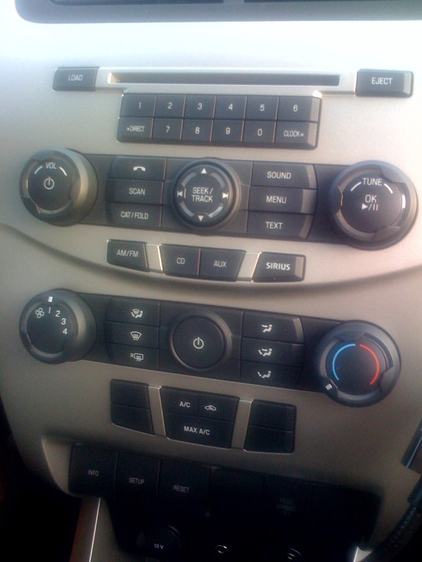
posted by Jeff | Tuesday, June 16, 2009, 9:13 PM | comments: 4Diana was given a Ford Focus for a rental for her business trip. One of my frustrations with American cars has always been the complete disregard for ergonomics and human factors. So check out this center console...
If this were a Web site's UI, it would be the equivalent of a 90's GeoCities page. It seems as though no consideration was given to design at all. It's a grid of buttons, with a few dials stuck in there (which are also poorly designed).
Start with the numeric buttons. First off, does anyone really need 10 of them? If so, having a row of six, then a row of four flanked by identical buttons, is completely unnatural feeling. They also have no hints to feel your way around while driving, requiring you to look. For example, many radios have a notch on the middle two buttons, much like those found on your "F" and "J" keys on your keyboard.
The next group of buttons are not clear at all, and then the next group of function buttons are spaced out in a way that doesn't make sense.
Then what's up with the climate controls? Why is there a power button, and how do I even know it's for the heat and A/C? Every other sensible arrangement has "power" associated with the fan speed, which makes more sense. The six blowing combinations as buttons doesn't make sense either, and a knob would be more logical. Then there are more random buttons below it.
The key to successful car controls is to make them as simple as possible, and navigable by touch as much as possible. This is a ton of clutter, it's ugly and hard to remember by touch.
Comments
B
June 17, 2009, 7:27 AM #Ford is only still "floating" because they secured boat loads of financing prior to the credit market implosion. They're still bleeding cash just as rapidly as GM, Chrysler, Toyota, etc., and will probably run aground in a year or so.
That said, horrible ergonomics are hardly indicative of domestic autos.
Phil
June 17, 2009, 9:34 AM #I agree that this stack would take some getting used to, but why do domestic car haters have to generalize that "American cars" have "complete disregard for ergonomics and human factors". Jeff may have been exaggerating his position a bit, but I'm quite certain if you surveyed late model foreign cars center stacks, you'd find just as much confusion if not more. Find me one positive review on the BMW idrive system for instance, other than "it's been improved".
