Cleaning up the non-deliberate UI of POP Forums
posted by Jeff | Tuesday, June 7, 2022, 11:17 PM | comments: 0Someday I'll have the answer to understand why I can't quit my open source forum app. Recently, I got over the hump about starting to revise the UI, which has evolved in a non-deliberate way for years. Instead of trying to embrace one of the many libraries out there, all of which are overkill and don't make a lot of sense for walls of text, I decided that native web components are supported well enough that it made sense to port my spaghetti code to those. I'm actually having fun with that and learning new things and using Typescript in a non-trivial way, but that's a totally separate topic. I wanted to capture where things are today, in part so I can laugh at it at some future date, but also to organize my thoughts. I'm on a tear with commits, partly because I don't have a great way yet to test without deploying a build. Safari on iOS is the new IE11, and it tends to not work like other browsers.
First off, let me work through the topic list.
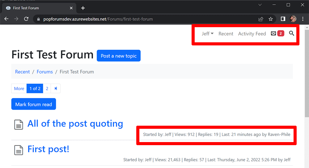
I've already started to revise the upper right navigation because there will be a new notification count up there, and I wanted to keep those counts and the search visible even on mobile. One thing about that is the inclusion of the recent link, which is often redundant everywhere but the home page. Some people prefer to use that as their starting point instead of the individual forums. Those folks also don't use the mark-all-read function, so they have hundreds or thousands of last-time-read records. My suspicion is that I can include a notification all-read function to be the same thing.
The other thing I've never quite found a use for is the topic stats (they appear under forums on the home page as well). These don't even appear on mobile at all, and they exist mostly because forums have had those since the beginning of time. Definitely no one cares who made the last post in a forum, and I'm not sure if they care about it in topics. I look at the reply count sometimes. I think that people may be interested to know what's "hot," but depending on the community, that could mean lots of view or lots of replies, or both. I wonder if there's a way to visually represent that.
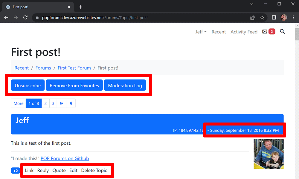
The post pages are a bigger mess. The moderation log button only appears for moderators (obvs), but the subscribe and favorite buttons seem clunky. Also, "subscribe" currently means email notification, but it'll switch to in-app notification, and users will have an option to subscribe to anything they post in automatically. There aren't really icons for these actions that follow an understood convention, let alone in six languages.
The date I call out because it does show things like "4 minutes ago" and update every minute. They count up the first hour in minutes, then say "today" or "yesterday" with the appropriate time, in all six languages. The problem is that they come from the server and depend on the user's profile time zone, otherwise defaulting to a time zone in the settings. Ideally, this would all be in the browser using the browser's time zone and I can persist the language parts in the header or something. Rewriting that will be gross though. It's 60 lines of code that I barely understand, and I haven't researched if the browser knows anything about the use or non-use of daylight saving.
The post tools I've always hated. I do think that these could use icons, something like a chain link, a reply icon as seen in every email app, quotation marks and a square-and-pencil (delete is only seen my moderators). I'm worried that these would appear even junkier than the words, and I don't know if they translate well into the other languages. No matter what, I'm thrilled with the improved post quoting.
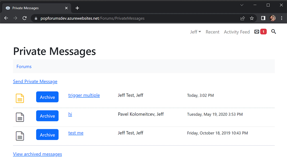
Private messages are kind of dumb the way they're set up now, because they follow an email paradigm. It would be easy enough to just make this straight-up chat, I guess. I already converted the new message badge to be real-time, so the notification mechanism is already there. I would have to ditch titles and limit users to one "thread" per user, or groups of users.
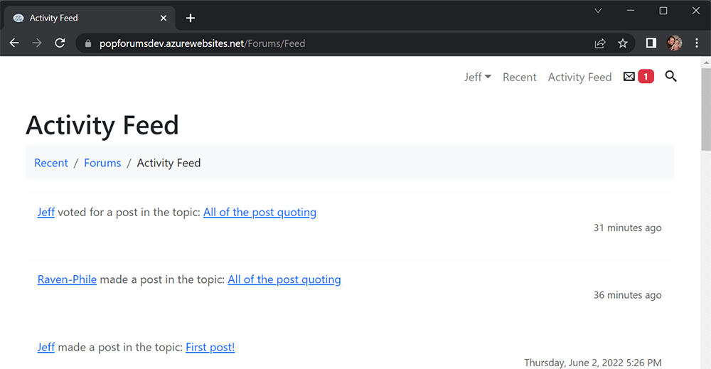
Stats show that exactly five people use the activity feed on CoasterBuzz, and I literally know most of them. I imagine I could throw it away and keep the individual feeds on user profiles for novelty, and beyond that, the future notifications may satisfy the same curiosity.
The other thing not pictured here is the Q&A forum layout, which is better than it used to be. That's a pretty specific use case, and mostly known to people who use something like StackOverflow. We have one of those on PointBuzz, and no one ever marks an answer as "the one," which could be a UI problem or people don't care or both.
I'm giving myself the rest of the year to act on this stuff, and I'll ship whatever I have. The number of things in the "done" column are already pretty high. Heck I'm just thrilled with the post quoting. It already eliminated the gratuitous whole-post quoting.
Comments
No comments yet.